Last Updated on 2 years by Sophia
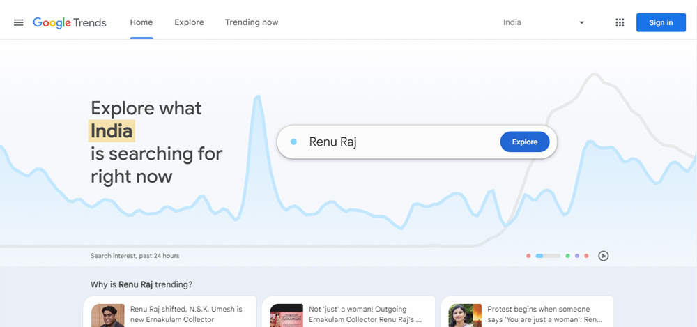
In order to give consumers a sleek and contemporary interface to discover the newest trends and subjects, Google just created a brand-new design and feel for the Google Trends portal. With better functionality and user experience, this revised version of Google Trends should make it simpler than ever for users to obtain the data they require.
The new homepage of the Google Trends portal, which has a simpler and more user-friendly appearance, is one of the most noticeable modifications. The new homepage is simpler to use and has a clean, uncluttered design that highlights the newest trending topics and most-searched terms. Users will find it quicker and more effectively to find the information they require as a result.
The Google Trends portal has received a number of significant modifications to its overall design and feel in addition to the updated homepage. These adjustments include new colour schemes, fonts, and design components, all of which contribute to making the user experience more unified and aesthetically pleasing. Of course, these modifications go beyond aesthetics.
The updated Google Trends interface also offers a number of brand-new features and capabilities that increase its utility. Users can now display data for up to five search terms at once, for instance, making it simpler to contrast and analyse various trends and themes. Users can now further filter search data by time period and country, enabling more accurate examination of trends and themes.
Nevertheless, compared to its predecessor, the new Google Trends portal offers customers a more cutting-edge and user-friendly experience. This enhanced edition of Google Trends is certain to give you the insights and information you require, whether you are a marketer, journalist, or simply someone who enjoys keeping up with the most recent trends. So why not give it a try and see for yourself what the fuss is about?

